ECLIPSE
SOUNDSCAPES
Empowering the blind and visually impaired with an enriched celestial event encounter.
OVERVIEW
NASA: Eclipse Soundscape Citizen Science Project
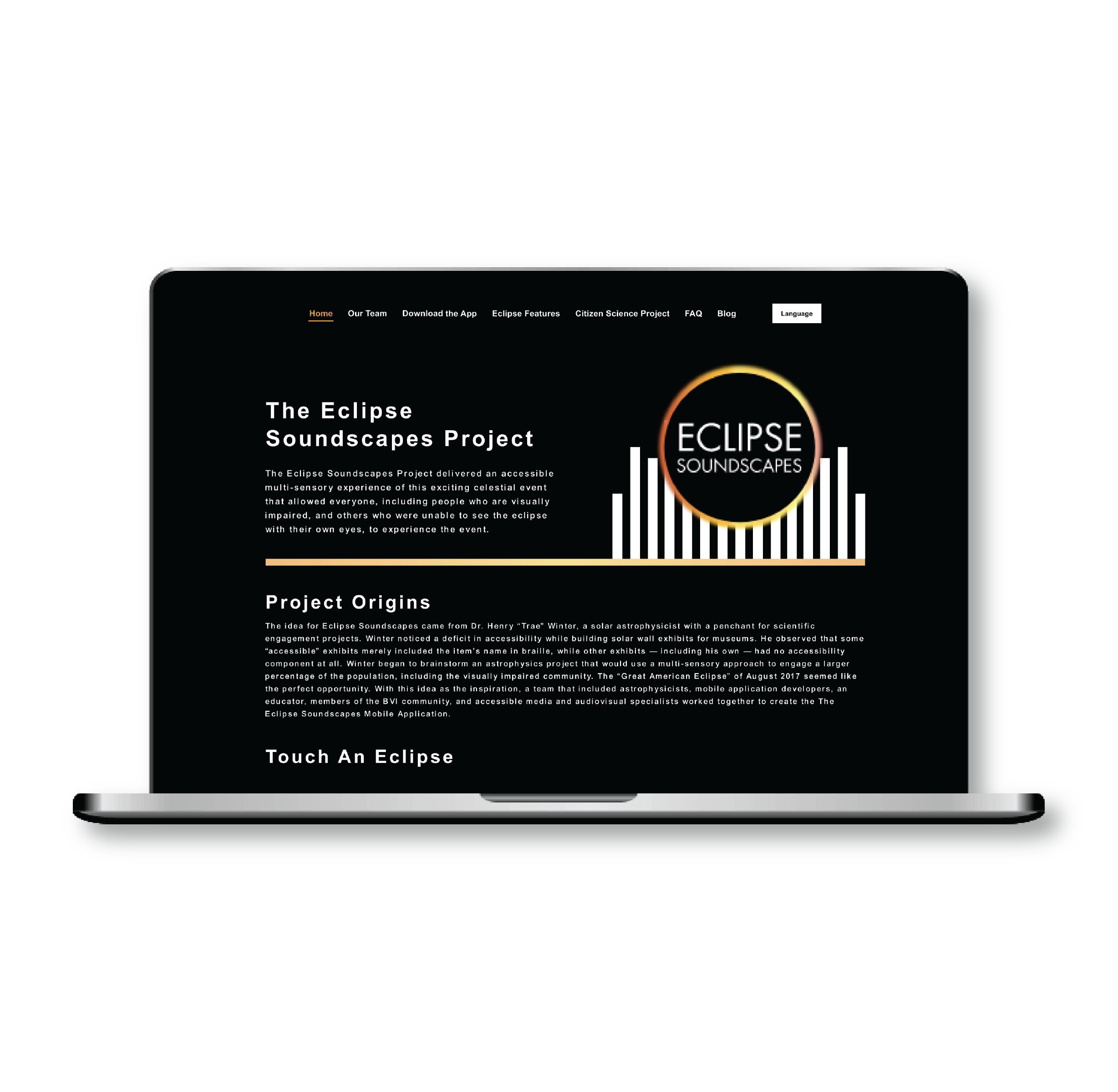
The Eclipse Soundscapes Project aims to deliver an accessible multi-sensory mobile and website digital experience of total solar eclipse that allowed everyone, including people who are visually impaired, and others who were unable to see the eclipse with their own eyes, to experience the event.
This website redesign project is supported by NASA’s Space Science Education Consortium (NSSEC), the goal is to create an accessible web experience following the WCAG requirements, so it can better serve low vision and blind citizen scientist communities, and at the same time benefit general users.
The problem
How might we improve accessible visual experiences for visually impaired users and at the same time benefit the general users. The elements and navigation on the pages are difficult to read and click, due to compact spacing and lack of visual indications, so this can be difficult for visually impaired and attention deficit group to navigate through the website. Thus, users have difficulties in visual understanding and navigation on the website pages.
The solution
We’ve created an accessible experience following the WCAG requirements, which will serve citizen scientists and be accessible for low vision and blind communities. Our solution has been designed to create more opportunities for everyone to participate in science.
How can we design web pages that are accessible for individuals with low vision, blindness, as well as citizen scientists, ensuring they can effortlessly navigate and comprehend the Eclipse Soundscape website?
CATEGORY
Accessible design
TEAM
Jayden Kim
Rithika Repakula
Yiting Zeng
MY ROLE
UX research
UX design
Visual design
TOOL
Figma, Adobe Illustrator, Miro
RESEARCH
Desk Research & Interview
The whole redesign process started with conducting the Heuristic Evaluation as a group so that we could find as many usability problems across the whole existing website as possible, and then we sorted all the problems into broader actionable categories.
After we identified the potential pain points from Heuristic Evaluation, we prepared a list of questions for our client ARISA Lab, so we can confirm previous design decisions from a business perspective. With a broader picture of why things are designed the way before, we had a clearer path moving forward on examining the current information architecture and user flow.
Affinity Mapping
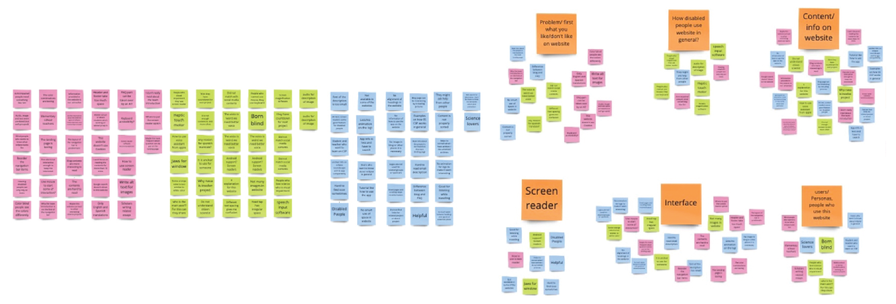
After conducting research, my teammates and I converged to share our findings and make sense of our research. We put key information into Post-its, revisited our notes, mentioned key learnings, and shared inspiring stories from people. Then, we clustered similar Post-its together and created an affinity map. We found two themes and discovered two insights within each theme.
DEFINE
Themes & Insights: Key User Pain Points
After downloading the research into an affinity map, we uncovered consistent pain points among the users. We grouped them into two big themes and came up with insights that summarized the consistent issues with users experiencing the website.

Indistinguishable
-
Information displayed over the background on the screen does not contrast well with the background.
-
People with low vision either magnify the screen to recognize the information being displayed.
How might we provide an experience that allows low-vision users to easily perceive information on the screen?
Unsupported screen reader users
-
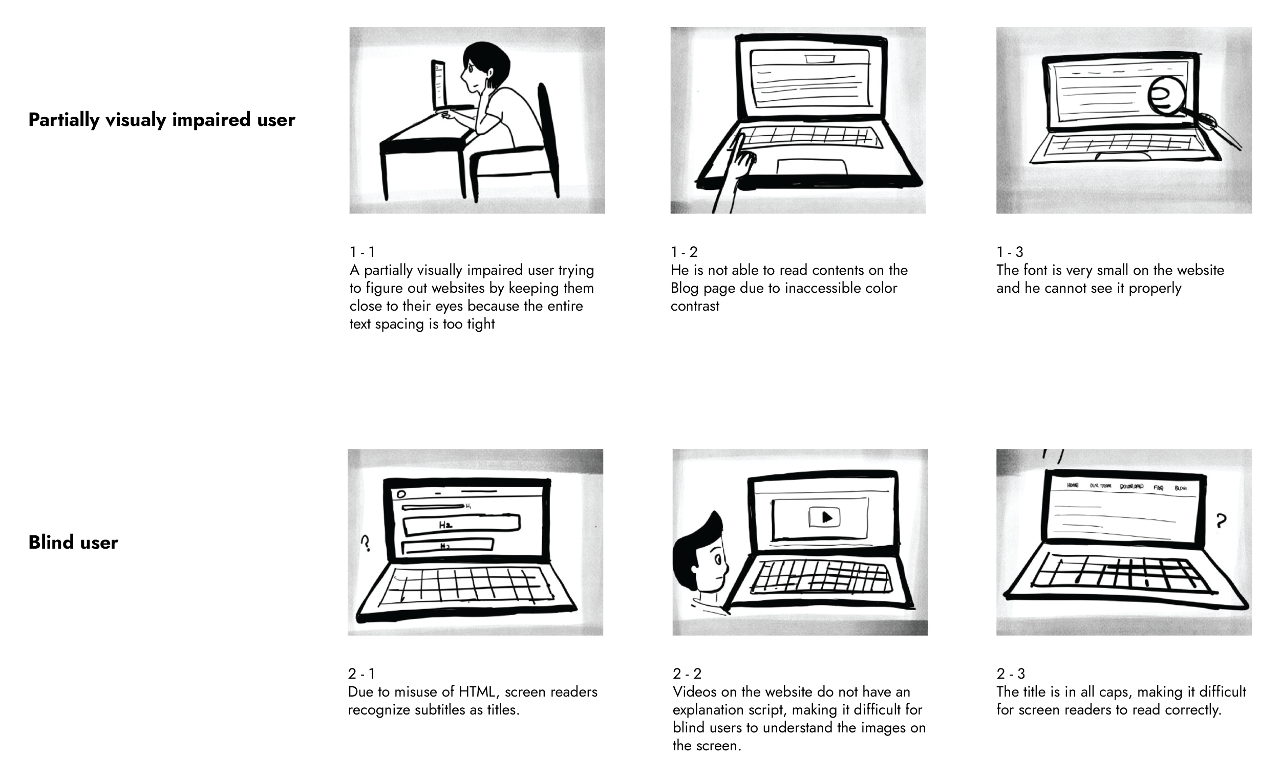
The use of incorrect heading tags can make it difficult for the users to navigate the website.
-
All caps text can cause problems for the users because words can sometimes be mistaken for abbreviations.
How might we creat a website more accessible to users with visual impairments who use screen readers?
Personas
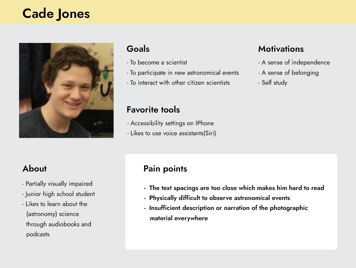
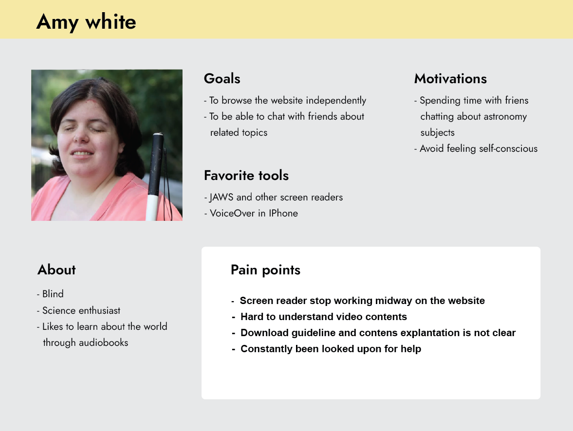
Based on our learnings from the research, I created two personas as my target users. My first persona is partially visually impaired and my second persona is blind; we chose to put them into two groups because they have very different needs and considerations.
Storyboarding: Old User Journey
DESIGN
Ideation: Design Cocept
After conducting a comprehensive evaluation of our problem statement, we discovered that the existing accessibility issues extend beyond just screen reader users. General users and individuals with low vision also encounter difficulties.
“Color contrast of background and text, and text spacing are not important to blind users. Because they will use voice-over to interact with the web”
Designing for the visually impaired users
-
High contrast between background and text
-
Accessible color palettes
-
Font size and text spacing new UI
Designing for the blind users
-
Video contents with audio transcript
-
Creat navigation without all Caps
-
Follow HTML header format
User flow
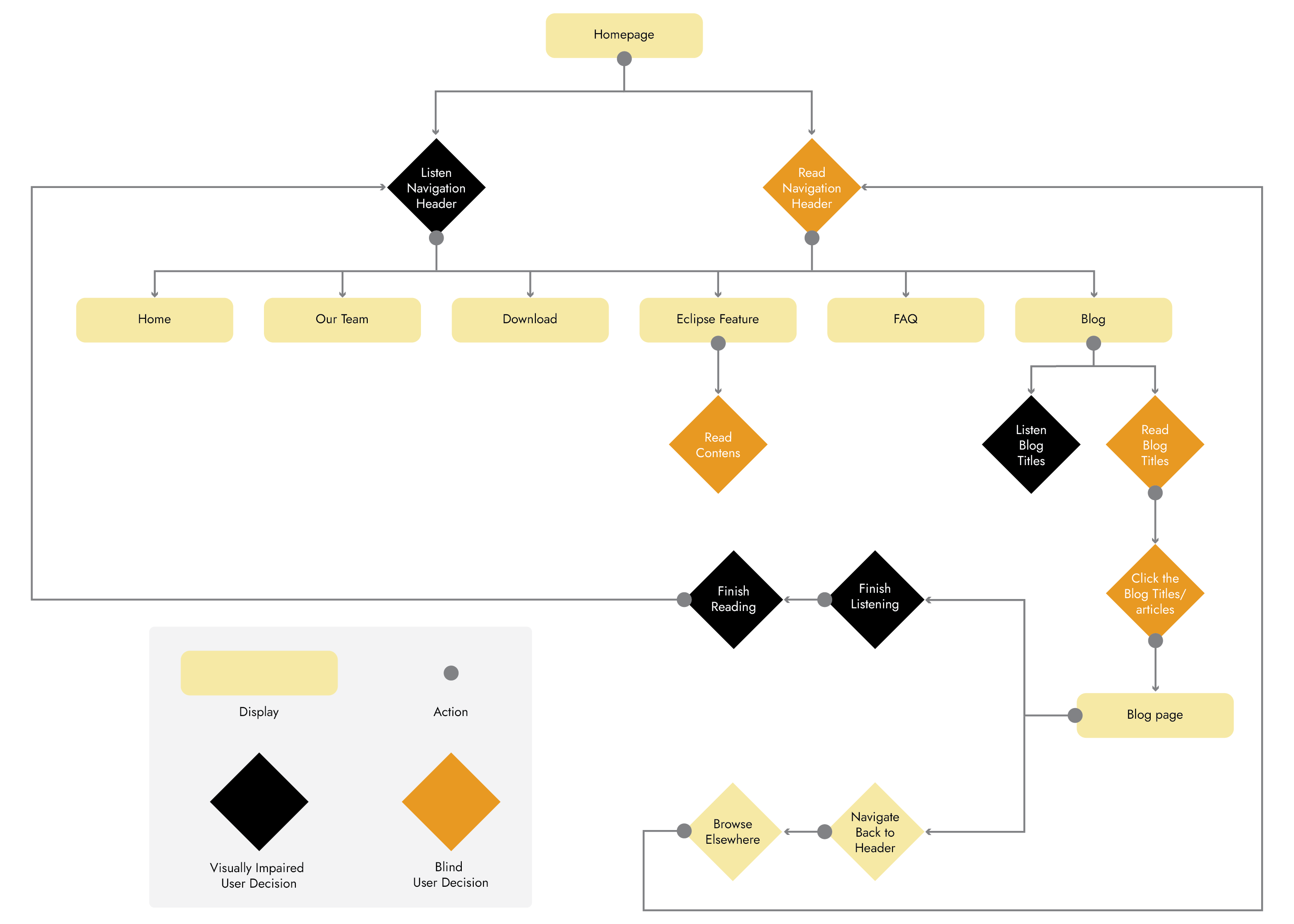
Specifically, blind users and partially visually impaired users follow distinct user flows when browsing our current website. Notably, screen reader users face additional steps and clicks as they continuously backtrack to hear all the available navigation options for effective navigation.
Wireframes & Visual Design
Accessible Design
For visually impaired users, the most urgent issue with the current website is color usage. Without an accessible color contrast, a high percentage of Bounce Rate(the percentage of visitors to a particular website who navigate away from the site after viewing only one page) can be easily predicted.
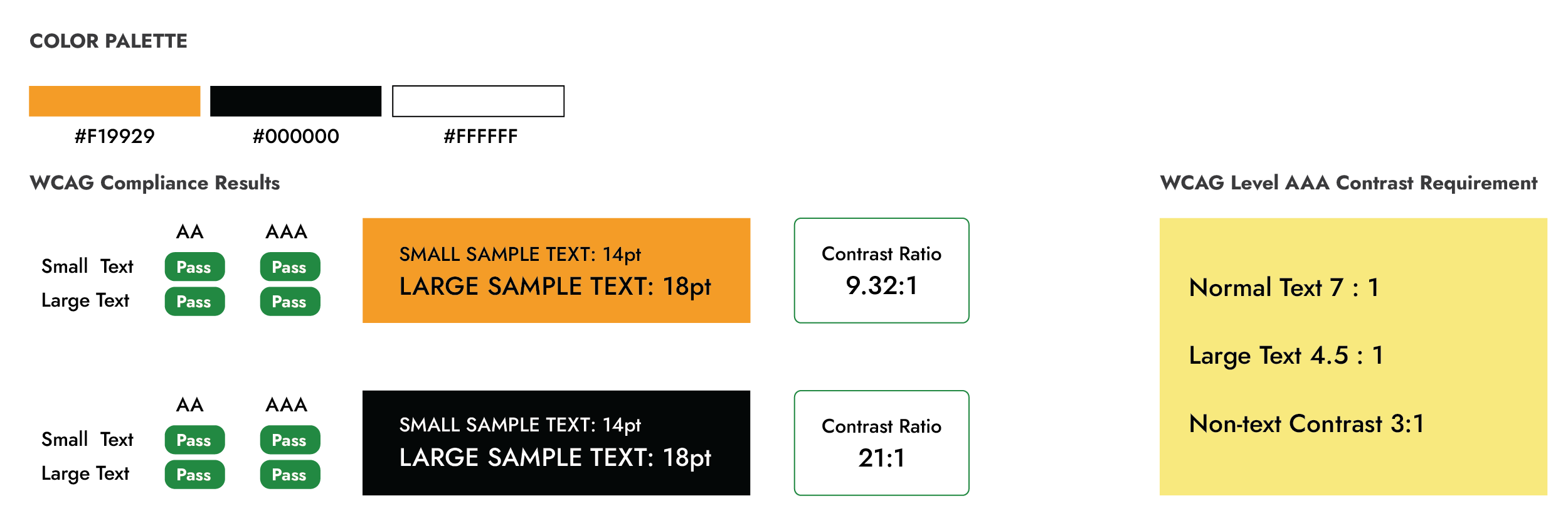
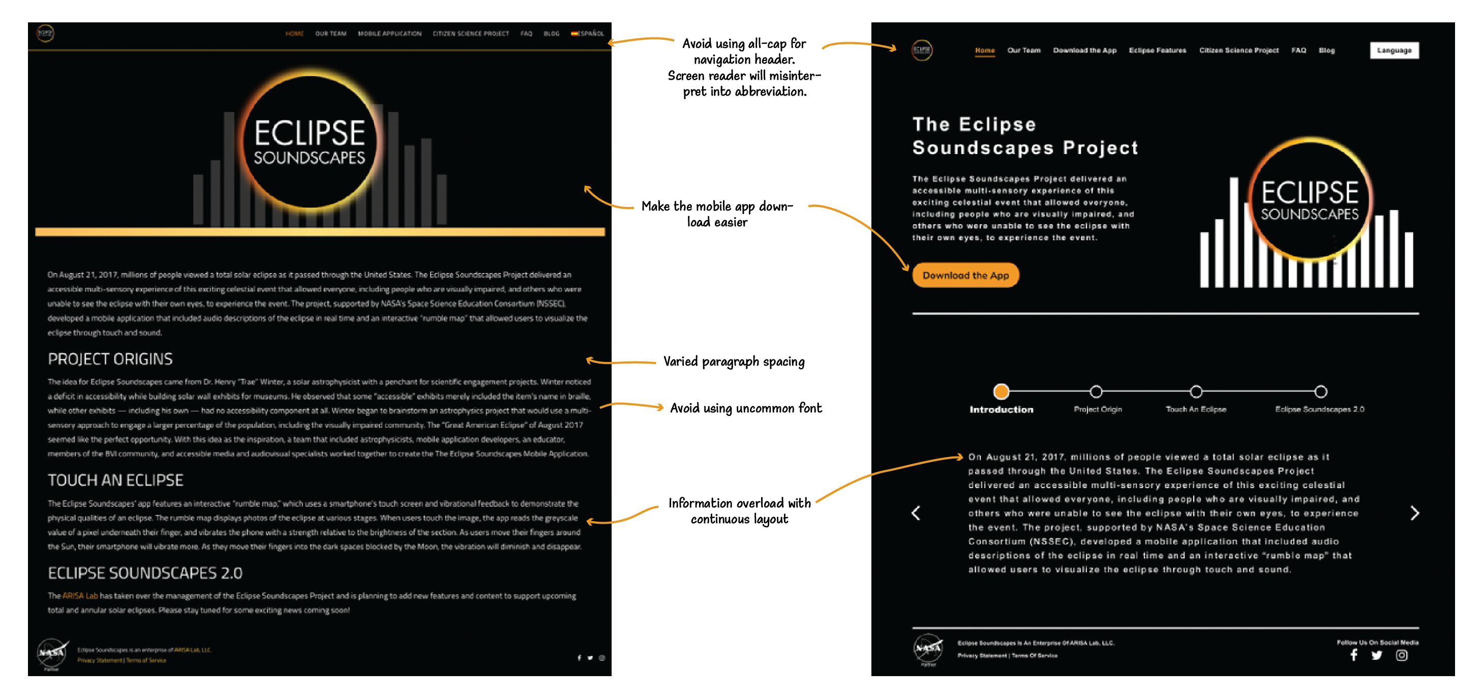
Other than color contrast, the weirdly spaced components plus inaccessible text spacing also played important roles in affecting the readability of the whole website. According to WCAG, Level AAA requires Line Height to be at least 1.5 times the font size, and Lettering Spacing to be at least 0.12 times the font size.
When designing with 2 disabled personas and accessibility in mind, we need to understand that this project should not be so heavily visually focused as a normal website redesign, but instead should focus on how to organize content in a clear and simple way for screen reader users to navigate. So the first version I created for the "Our Team" page made a mistake that neglected screen reader usability by adding more steps for them to view the content. What we thought was "visually pleasant" may not be the right design here.
Final Prototype


Project Learnings
USER RESEARCH IS ESSENTIAL
We discovered a lot about blind and visually impaired needs during our initial research. These insights really helped us arrive at our final solution. By doing user research, we were able to identify the problem areas to solve.
SEEK USER FEEDBACK EARLY AND CONTINUALLY
By testing ideas early on, we were able to hone in on a strong concept. Conducting multiple rounds of user testing helped us better design the app for our users. There were a lot of small details that we improved based on Arisa Labs’ feedback.
