
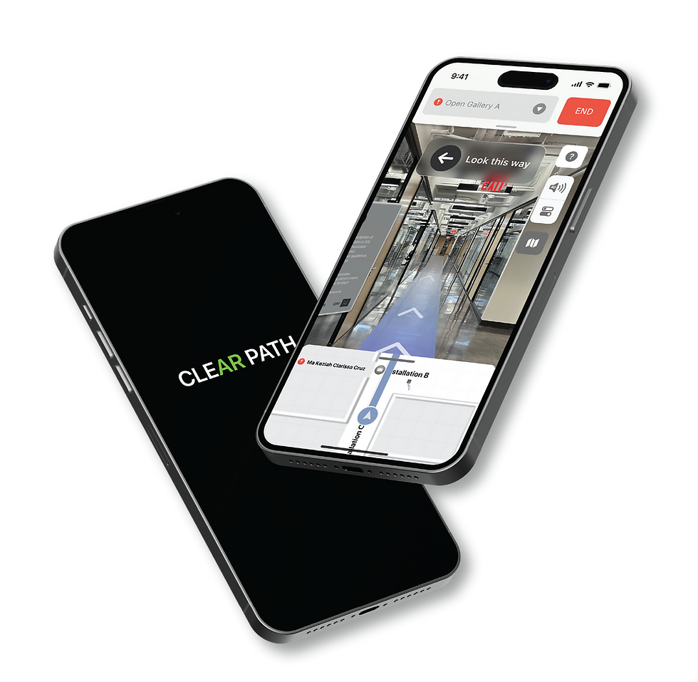
CLEAR PATH
Enhancing the AR indoor navigation experiencefor people who are blind and visually impaired
OVERVIEW
CATEGORY
User experience design
Accessible design
AR development
CATEGORY
Unity(AR Foundation), Xcode, Figma,Blender, Adobe Dimension, Illustration
The problem
Blind or visually impaired individuals often utilize mobile navigation apps such as Google Maps or Apple Maps to form a mental map before visiting unfamiliar places and travel to their destination independently. Access to reliable multi-sensory navigation services is crucial for individuals of all abilities. However, upon reaching indoor spaces, they often face challenges in independent exploration and frequently experience frustration in obtaining and using assistive devices.
How might we develop an AR navigation system that effectively enhances indoor accessibility and usability for the blind and visually impaired?
The solution
ClearPath is an innovative mobile app that enhances the AR indoor navigation experience, catering to individuals of all abilities. By seamlessly integrating audio descriptions and spatial sound instructions within indoor environments, ClearPath eliminates the dependence on external assistive devices and physical assistance. By providing convenient access to VoiceOver on iOS devices, empowering users to navigate indoor spaces with greater independence.
MY ROLE
UX RESEARCH
Interviews
Persona mapping
Journey mapping
Uesr testing
UX RESEARCH
Sketches
Wireframing
Visual design(Assets, Icons, buttons)
Inclusive deisgn
AR PROTOTYPER
UI pages using C#
Interaction design in AR SceneSpatial sounds
3D Design
RESEARCH
Primary & Secondary Research
An integral aspect of this project involved recognizing and understanding a user group that had previously been overlooked. To develop empathy and gain insights from their perspective, I conducted an interview with Gus Chalkias, an Assistive Technology Specialist at Helen Keller Services for the Blind, who is also blind himself. Additionally, I extensively studied the NYU Accessibility Lab, a frequently visited location by blind and visually impaired individuals, to identify potential challenges in navigation.
Given the limited accessibility to my target audience, I actively engaged with various Facebook groups dedicated to blind and visually impaired individuals. Through this involvement, I conducted secondary research to gain a deeper understanding of their experiences, frustrations, and how they utilize smartphones to overcome daily obstacles. This comprehensive approach allowed us to better comprehend their needs and preferences.


Cane adventure at Helen Keller Services for the Blind

Google indoor maps at Penn Station in NYC

VoiceOver(Screenreader) on Apple maps
DEFINE
Themes & Insights: Key User Pain Points
After downloading the research into an affinity map, I uncovered consistent pain points among the users. I grouped them into three big themes and came up with insights that summarized the main problems with the AR indoor navigation experience
Cognitive and Technological Challenges
-
Users may struggle with processing a large amount of information presented simultaneously through AR interfaces, leading to confusion and inconsistency in navigation.
-
Outdated or inaccessible devices, lack of internet connectivity, or limited familiarity with technology can hinder users' ability to effectively utilize AR indoor navigation systems.
Limited Accessibility and Usability
-
Inadequate text-to-speech functionality, making it challenging for users to access visual information in a consistent manner.
-
Complex user interfaces with small buttons or icons that are difficult for users with limited vision or motor skills to interact with consistently.
Visual Impairment Variability
-
Some users may have low vision and can perceive certain details, while others may be completely blind and rely solely on auditory cues.
-
Users with color blindness or color vision deficiencies may struggle to differentiate certain colors or rely on high contrast for visibility.
HMW optimize the user interface of AR indoor navigation systems to provide intuitive navigation experiences for individuals with cognitive challenges?
HMW design a flexible visual settings feature that allows users with different visual impairments to customize the AR indoor navigation system?
HMW design a flexible visual settings feature that allows users with different visual impairments to customize the AR indoor navigation system?
How Augmented Reality Indoor Navigation Work
AR indoor navigation uses computer vision, mapping, and positioning technologies to guide users within indoor spaces. It creates a digital map of the environment, determines the user's position, overlays virtual information on real-world views, and provides real-time updates as users move. This enables intuitive navigation and interaction through augmented elements displayed on devices or smart glasses.
Admin Mode

User Mode

Image copyright grid dynamics
Competitor Analysis: AR Indoor Navigation Systems
In this competitor analysis, I evaluated six AR indoor navigation systems, namely VIEW AR, ARWAY, Augmented Pixels, Hyper AR, Mobidev, and NAVER indoor AR navigation. As the demand for AR-based indoor navigation systems grows, these companies offer distinct features and accessibility options while utilizing AR technology.


Indoor mapping design in Adobe illustrator

Initial sketch

Indoor mapping design in Unity
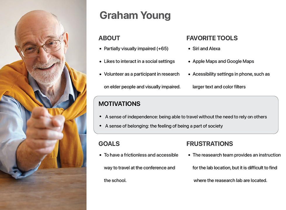
Personas
Based on my learnings from the research, I created two personas as my target users. My first persona is partially visually impaired and my second persona is blind; I chose to put them into two groups because they have very different needs and considerations.

Low Fidelity Prototype & User Testing
After the ideation section, I started prototyping using Unity. I created an augmented reality-based indoor navigation in Unity, and then conducted a user test with a total of 8 participants through idm show case. I take their valuable feedback. I took their valuable feedback to make multiple iterations.
Observation
After the ideation section, I started prototyping using Unity. I created an augmented reality-based indoor navigation in Unity, and then conducted a user test with a total of 8 participants through idm show case. I take their valuable feedback. I took their valuable feedback to make multiple iterations.
Navigation Accuracy
-
Users experienced inaccuracies in the alignment of virtual overlays with physical objects in the indoor environment.
User Interface (UI) Clarity
-
Users struggled to understand the purpose and functionality of certain UI elements.
User Guidance and Instructions
-
Users had difficulty understanding and following the instructions provided by the augmented reality navigation system.
Visual Design
After the ideation section, I started prototyping using Unity. I created an augmented reality-based indoor navigation in Unity, and then conducted a user test with a total of 8 participants through idm show case. I take their valuable feedback. I took their valuable feedback to make multiple iterations.


DESIGN
Ideation: Design Cocept
After downloading the research into an affinity map, I uncovered consistent pain points among the users. I grouped them into three big themes and came up with insights that summarized the main problems with the AR indoor navigation experience.
After downloading the research into an affinity map, I uncovered consistent pain points among the users. I grouped them into three big themes and came up with insights that summarized the main problems with the AR indoor navigation experience.After downloading the research into an affinity map, I uncovered consistent pain points among the users.
Storyboarding: New User Journey


Design with Accessibility in Mind
Part of the challenge of this project is to be very mindful of accessible design. After reading extensively about topic. I learned that blind users have very different needs from low-vision users when it comes to accessible apps. Details like contrast, typography, and color don’t matter to blind users, because they will interact with the app using VoiceOver.
DESIGNING FOR THE PARTIALLY VISUALLY IMPAIRED (COLOR BLIND OR LOW VISION)
-
Scalable font sizes
-
Accessible color palettes
-
High contrast between background and text
DESIGNING FOR THE BLIND
-
VoiceOver in iPhone and other screen reading tools
-
Use sound to communicate with user
-
Inputs/buttons with associated labels and descriptions
Dynamic Text Size
For people who have low vision or blurred vision, it’s really important for the app to support dynamic type. Text should scale smaller or bigger depending on the user’s preference for readability. The dynamic type should also be accommodated in the app layouts.
Standard text size
Larger text size
People with low or blurred vision areunable to read the text at standard size
People with low or blurred vision areunable to read the text at standard size
Accessible Color Palette
When it comes to color, people with visual impairments find it easier to read light text in dark mode. They also read better when there is high contrast between the background and the text. I used online tools like Color Safe to determine an accessible color palette and I used the Sketchapp plugin Stark to simulate different types of color blindness.

VoiceOver with Input Labels
For users who are blind, they rely heavily in the VoiceOver feature in iOS. By reading the contents in the screen, VoiceOver allows users to hear and interact with the screen without needing to see it.
One of the most overlooked accessible design/development choices is the absence of labels or lack of context in labels. Buttons and inputs should have associated labels and descriptions based on how VoiceOver would read it to the users.
In Unity, I use the UI Accessibility Plugin (UAP) to add context to labels for blind and visually impaired users.
EXAMPLE OF VOICEOVER LABELING


"Audio description button"

"Audio description button. Tapping this will hear an audible description of a 3D object in AR space"

Unity Ui development with Ui Accessibility Plugin(UAP)
Final Prototype
After conducting several rounds of user testing and incorporating iterative improvements, I dedicated our efforts to enhancing the visual design of the app. Furthermore, we prioritized accessibility by making the app compatible with screen readers, including VoiceOver on iOS. By enabling VoiceOver, blind and visually impaired users can easily navigate the app's user interface and access its features with minimal effort.
Project Learnings
BRIDGING THE EMPATHY GAP
One of the most significant lessons I gained from this project was realizing how much I lacked knowledge about accessible design and the specific needs of individuals with disabilities. In my effort to better understand their travel experiences, I explored how augmented reality technology could contribute to the formation of mental maps and discovered additional challenges in the process.
DESIGNING FOR XR INCLUSIVITY
Throughout this project, I acquired valuable insights into essential design considerations, including spatial sound, content labels, dynamic typefaces, and screen readers. These seemingly straightforward elements possess the power to substantially improve the usability of our product. By integrating these considerations right from the planning stage, we can facilitate engagement with the extended reality world for a wider range of individuals. Accessible design within the extended reality realm should not be confined; on the contrary, it has the potential to enhance the experience for all users.